Born from the belief that nourishing, high quality, planet-friendly products should be available to everyone, Wholesome is the online eco-health pantry and membership that makes a difference at every step. They tasked us with an end-to-end brand overhaul that would reflect the innovation of their DTC offering, looking, feeling and sounding as good as the brands and products they stock.
- Brand strategy •
- Visual identity •
- Verbal identity •
- Art direction •
- Photography •
- Illustration •
- Website design •
- Icon system
Featured In
What's all this then?
One of the most significant ways we can look after our health and the planet is through what we eat and the everyday products we buy. We all know this by now and yet, those brands and products are still either hard to find or outlandishly expensive. Enter Wholesome — the online eco-health pantry and membership that makes a different at every step. They believe it shouldn’t cost us more to do the right thing, so they offer curated-for-quality range of the best eco-health products at wholesale prices, as well as a promise that every purchase does good by you, the community and the planet.
Any insights?
The pandemic saw a boom and growing trust in online grocery delivery services but introduced a whole new level of choice paralysis. Add healthwashing and greenwashing into the mix and it’s near impossible to know what to choose or trust. And then there’s the cost issue. Health and sustainability are premium categories wherever you’re shopping, often making products price prohibitive, even when you know what you’re after.
And what seems to be the problem?
So, when convenience has become convention and everyone is shouting about savings, health or sustainability, how do we make Wholesome stand out? And how do we clearly distill the value of what it means to be a Wholesome member, while conveying their credibility, trustworthiness and genuine appetite to do good?
So how did you go about it?
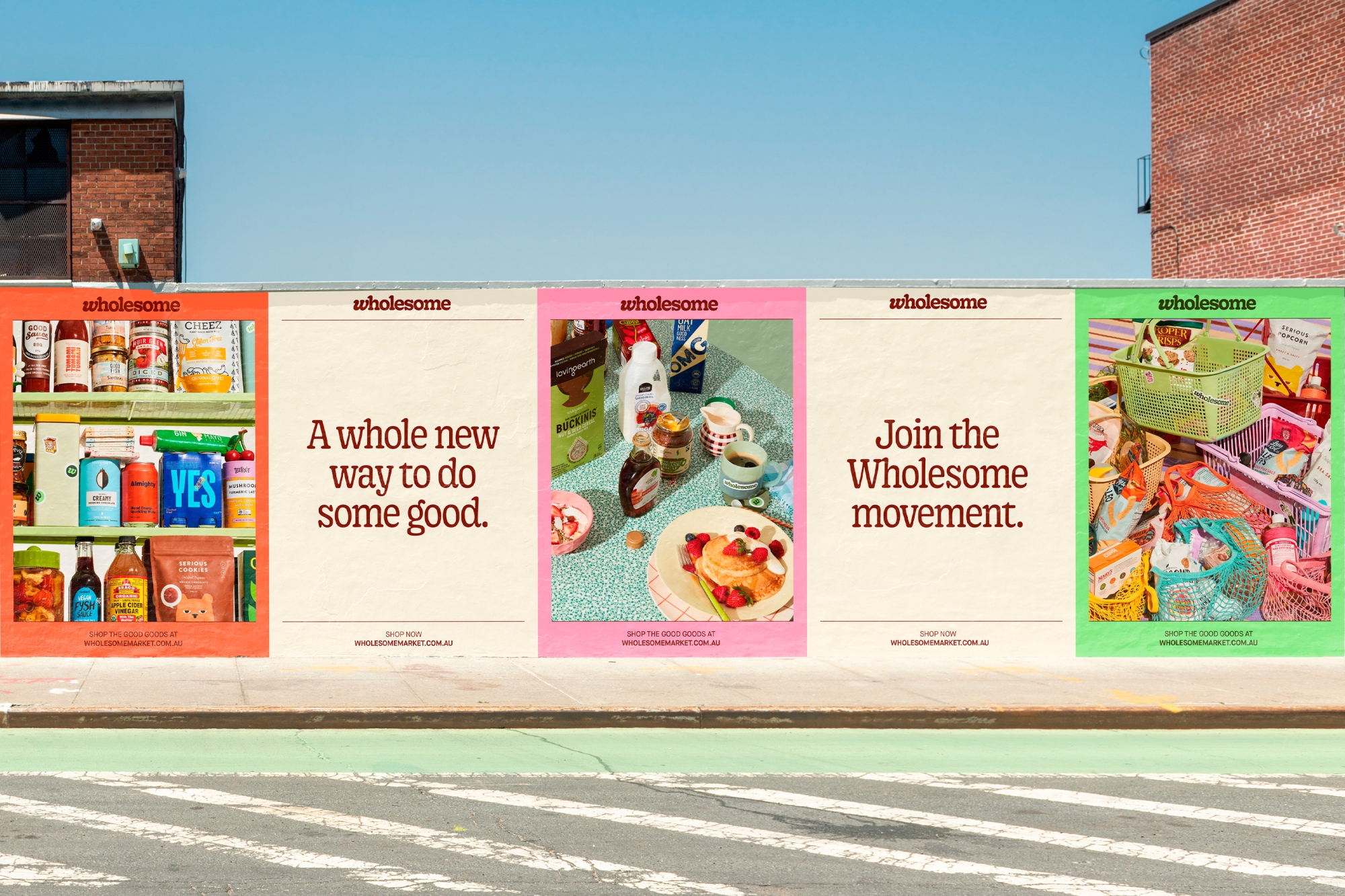
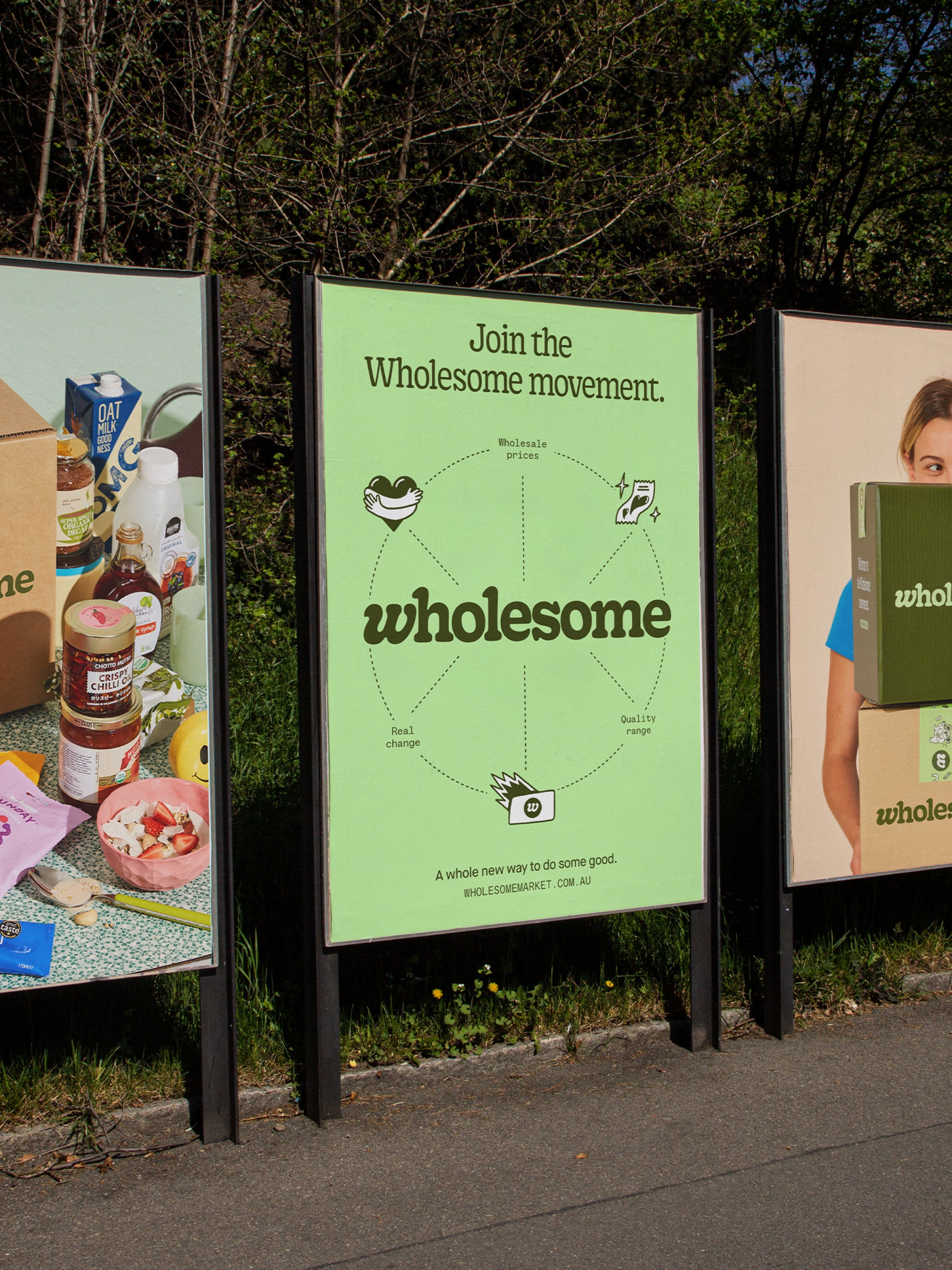
Teaming up with Untangld, we saw a strategic opportunity to create a new category that reflects both health and sustainability — eco-health. This evolved into the rousing idea of The Wholesome Movement — a band of empowered people buying better, together, to change the world for the better. The visual and verbal identities seamlessly carry this idea through to every touchpoint of the brand, embracing an educational ethos that informs consumers and gives their choices power.
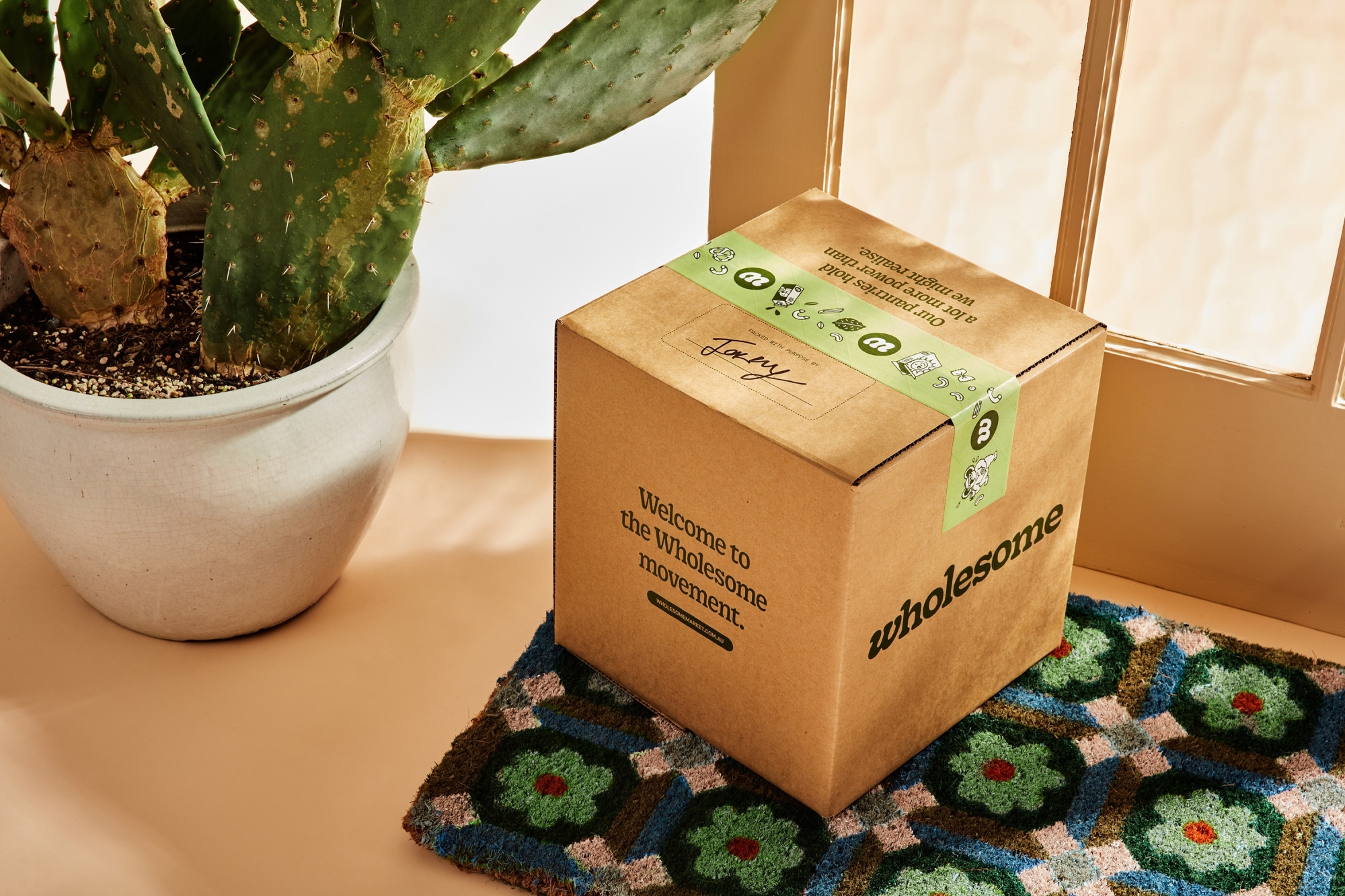
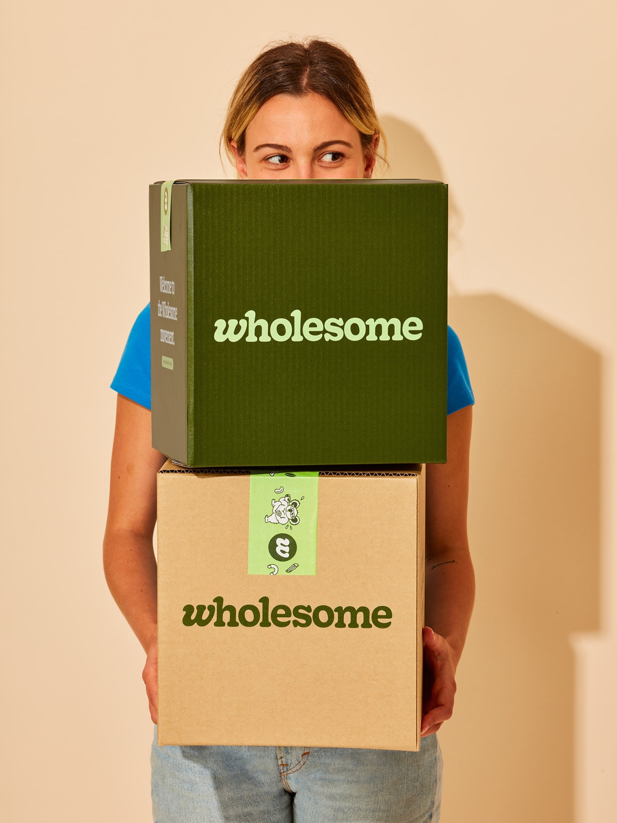
A warm welcome from the get-go
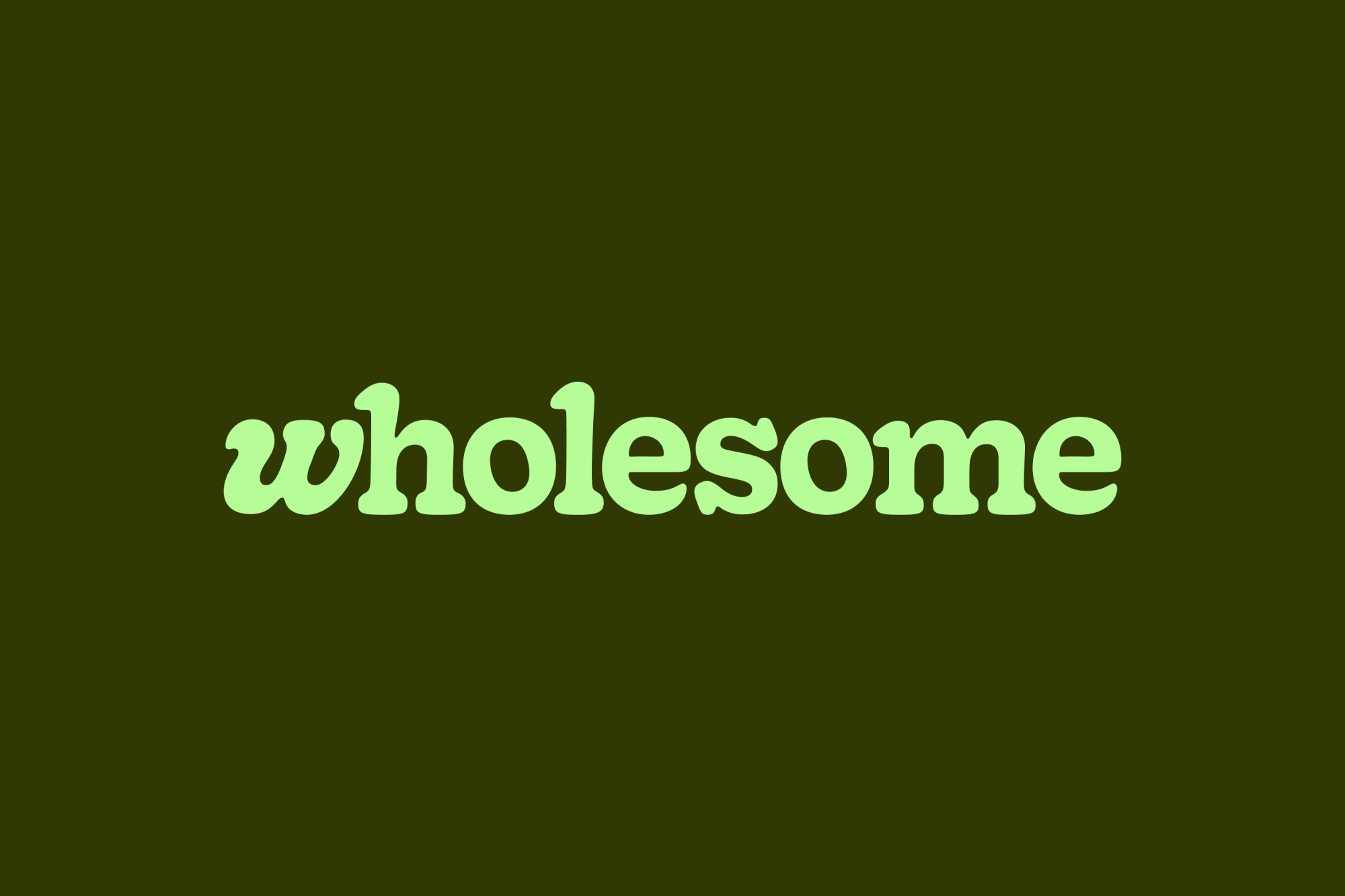
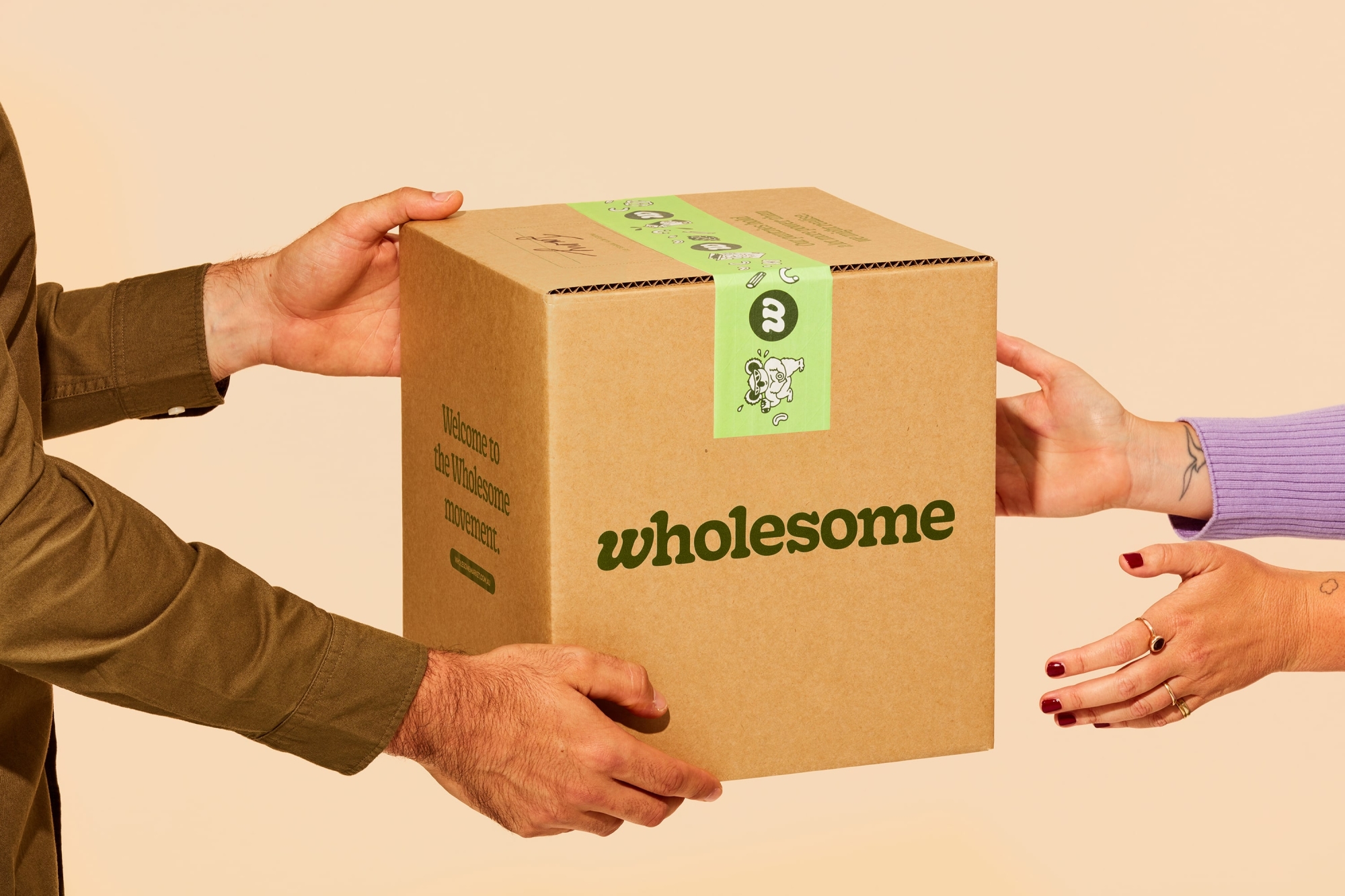
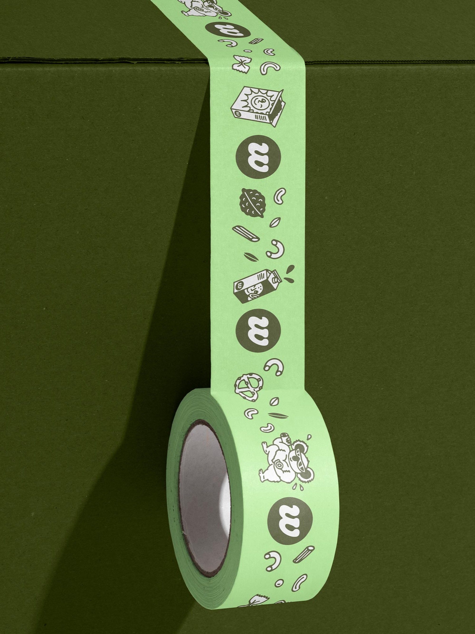
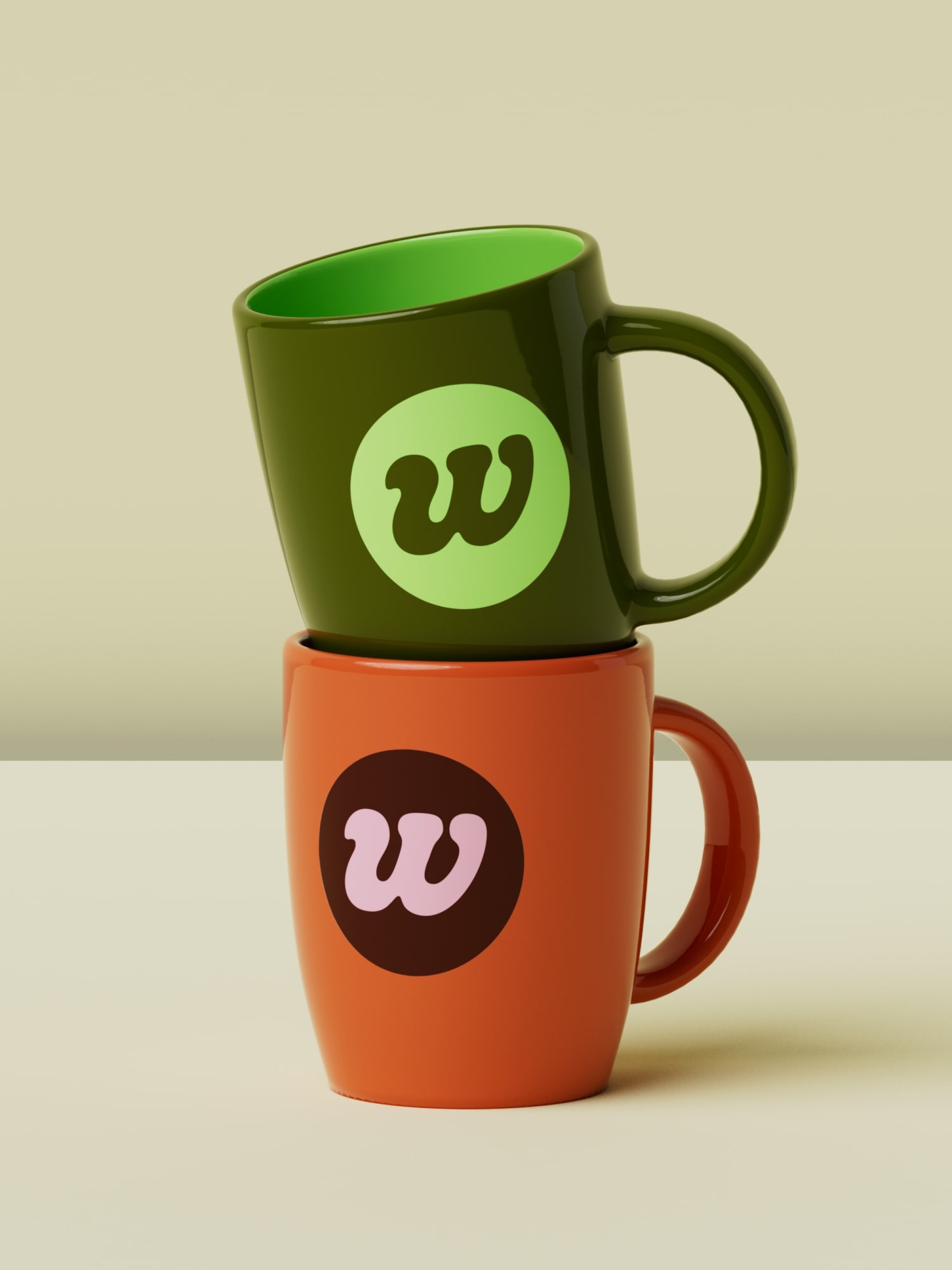
The logo is set in Gooper, a typeface that embodies the communal spirit of its heritage (the ever-ubiquitous, retro Cooper) while bringing its own goopy, playful flair. Slight customisations were made to the “W” allowing it to tuck neatly under the “H” ascender and also to shine as a standalone icon. With its soft edges and winding curves, the mark is distinctively warm and inviting.
The wholey trinity of typefaces
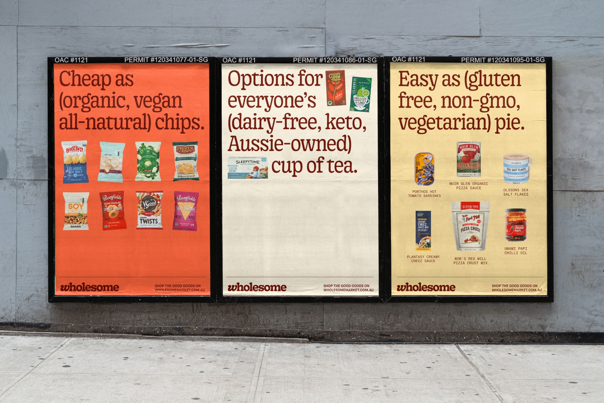
The typography intertwines practicality and expression. Gooper SemiCondensed is disarmingly personable with just enough charm for headers and large-scale use. Maison Neue takes out the role of best supporting typeface, providing a clean but friendly sans serif that’s ideal for smaller pops of copy. And then there’s Kale Sans Mono — the informative, matter-of-fact, typewriter-esque workhorse. Together they make for a type system that’s as rich in quality and variety as the brand they represent.
The voice of a revolution
The tone of voice, like the brand, needed to cater to a wide audience while still leaving the uniquenesses of our customers seen and heard. Copywriter Cat Wall assisted us in creating a voice that’s confidently easygoing, creating an immediate warmth and excitement. A lot of education needed to be done without being dull, so messaging is both to-the-point and rousing in its key lines, the rally cries for the Wholesome movement, letting consumers instantly know the benefits of the platform — a whole new way to do some good.
Our key trio of visual principles
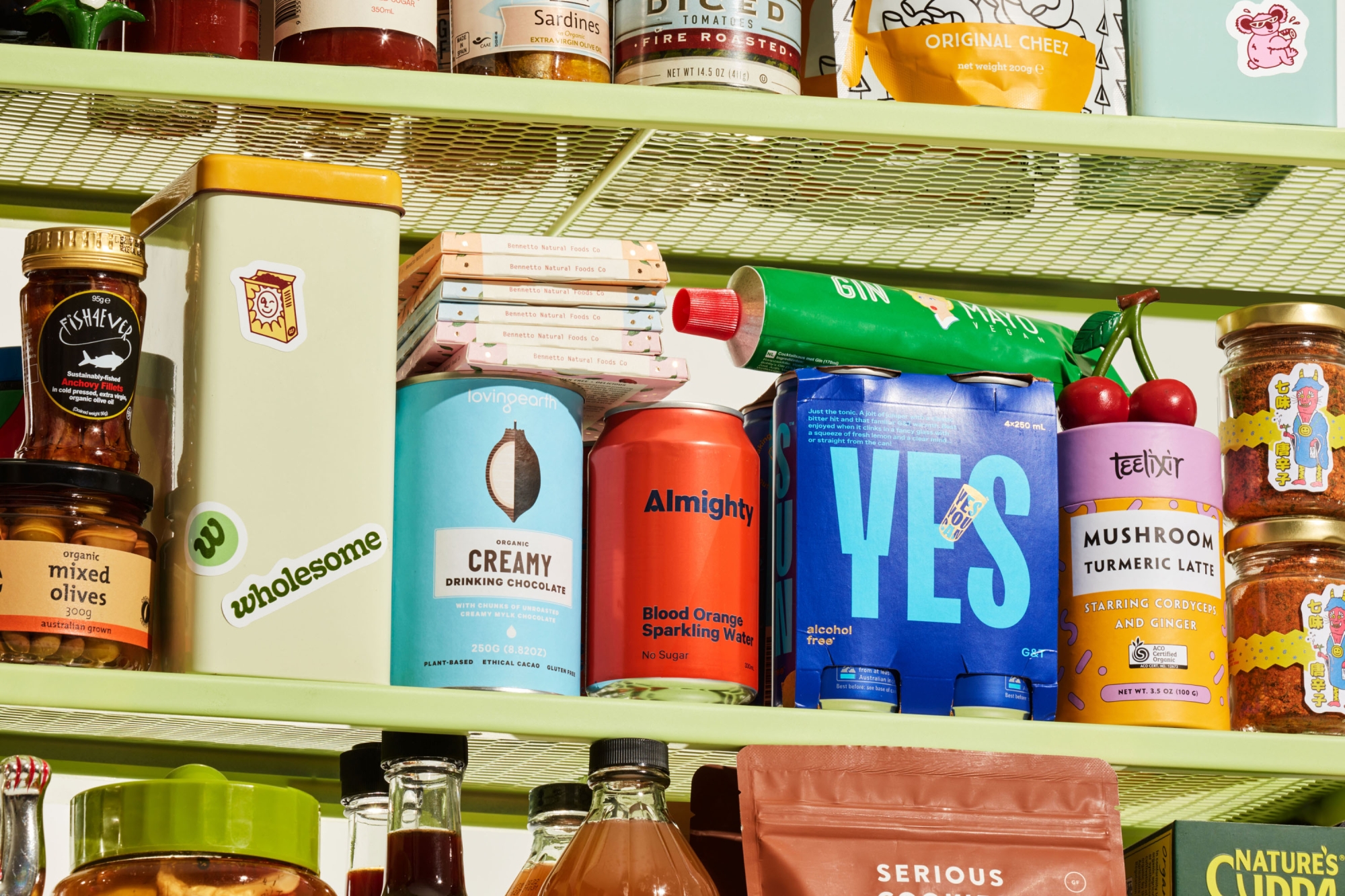
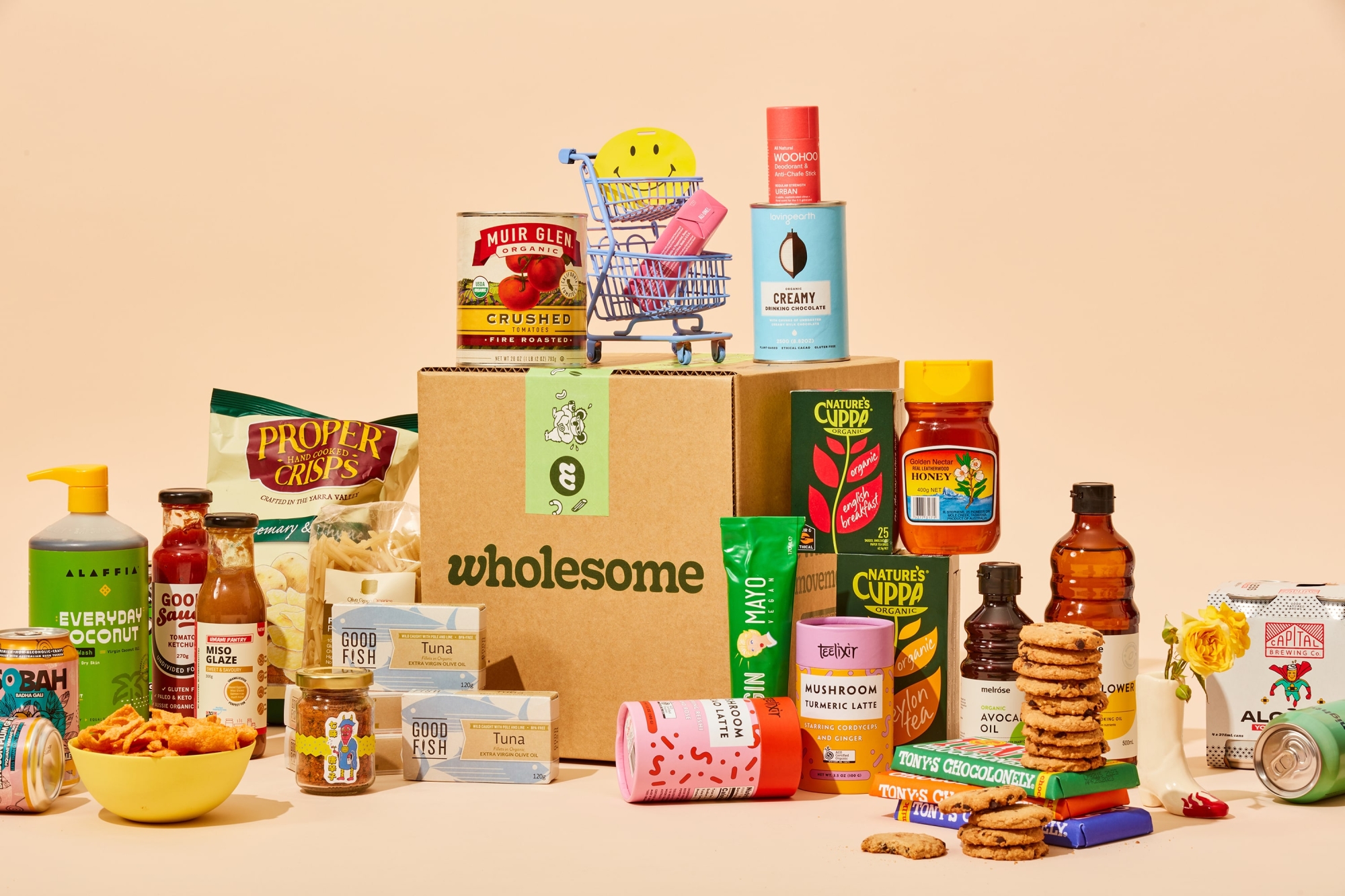
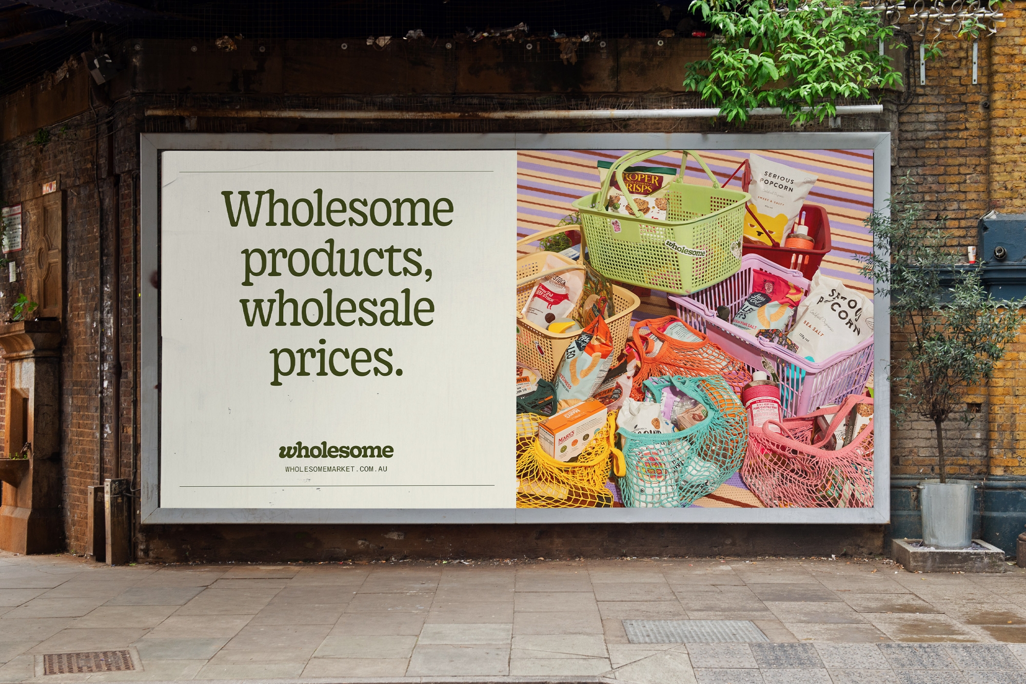
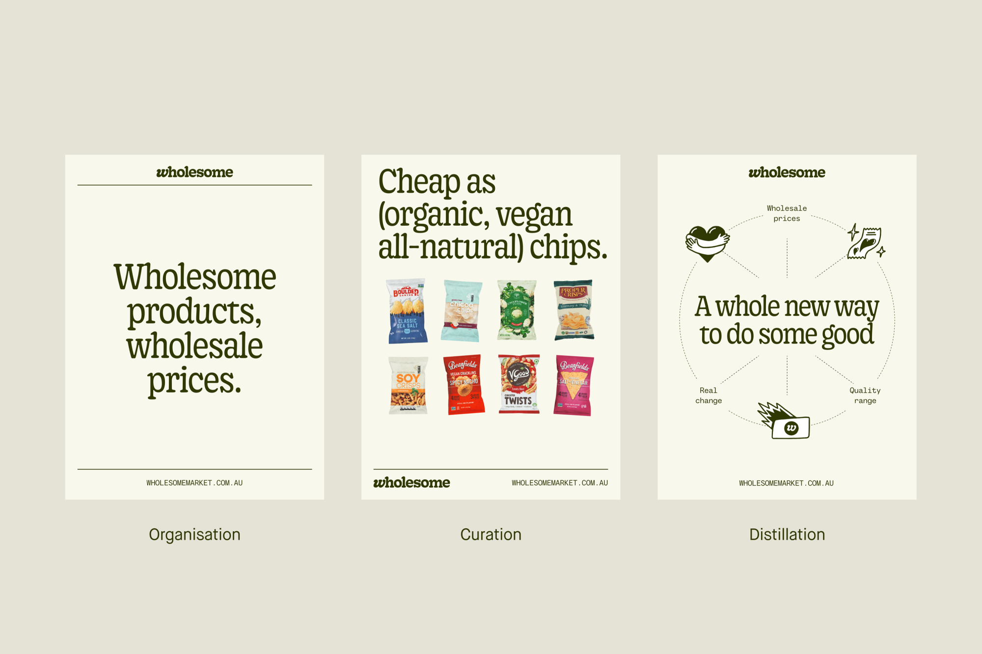
The overarching visual system is guided by three principles — organisation, curation and distillation. Inspired by shelves and pantries, the organisation element uses a modular grid system and lines to help create clean, pared back expressions of the brand. Curation takes its cues from grocery catalogues and their ability to bring people and products together. It explores deep-etched imagery to instil playful expressions into the brand. And distillation, inspired by Wholesome’s deeply considered curation of every single product, allowed us to leverage line devices, type and imagery into clear yet visually-distinctive diagrams. The three elements together allow the design to flex between simple and functional to joyful and expressive.
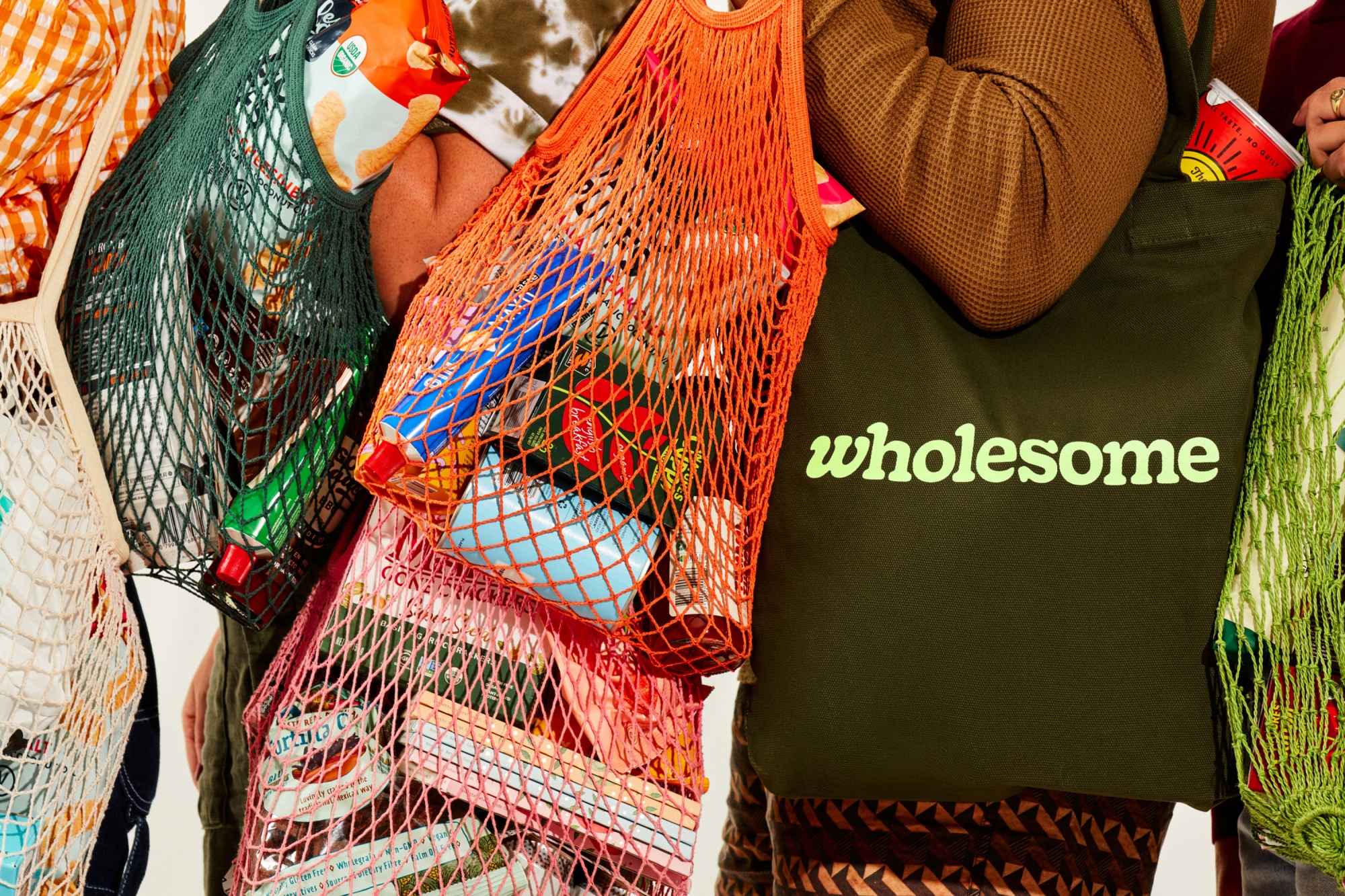
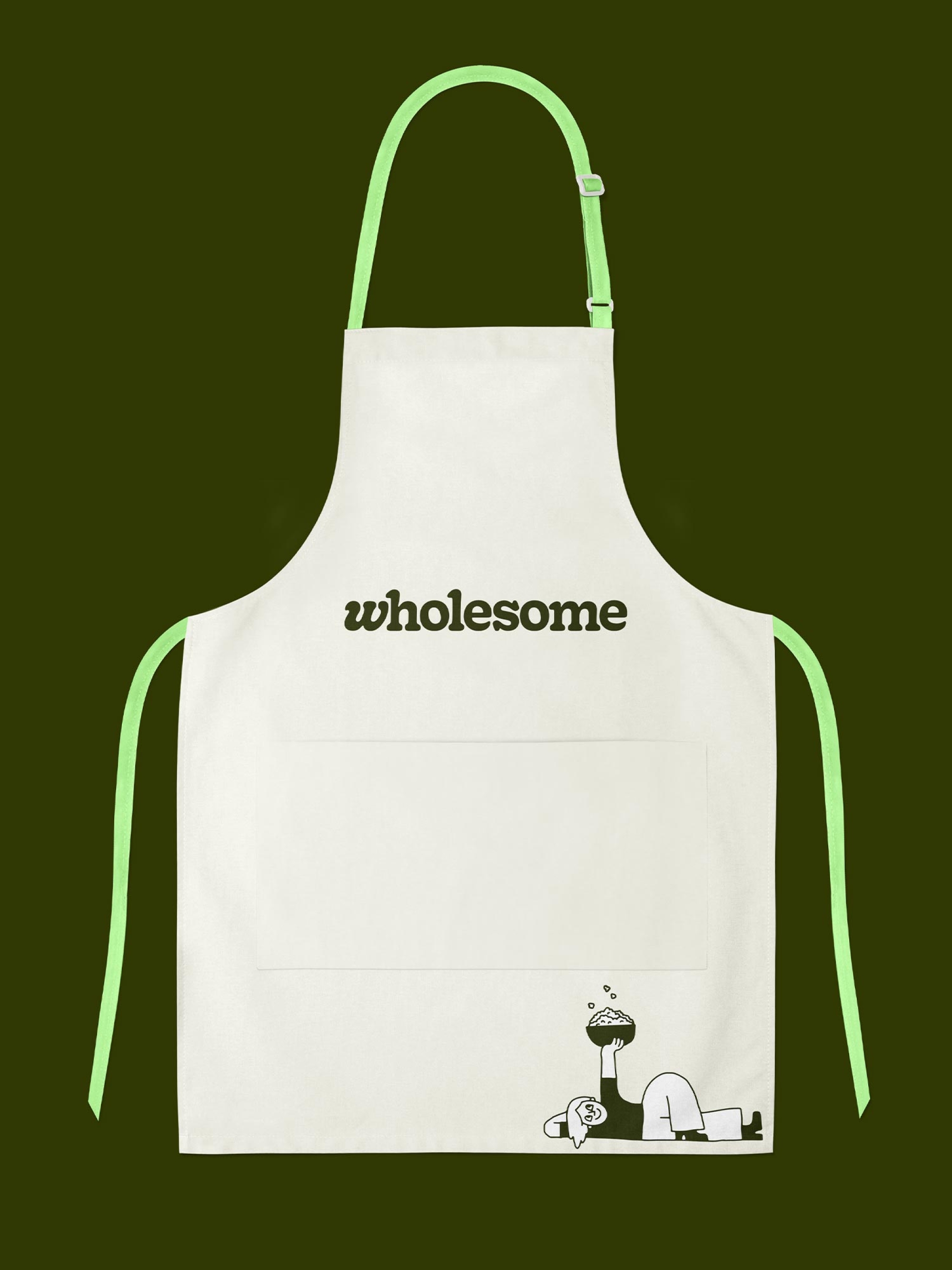
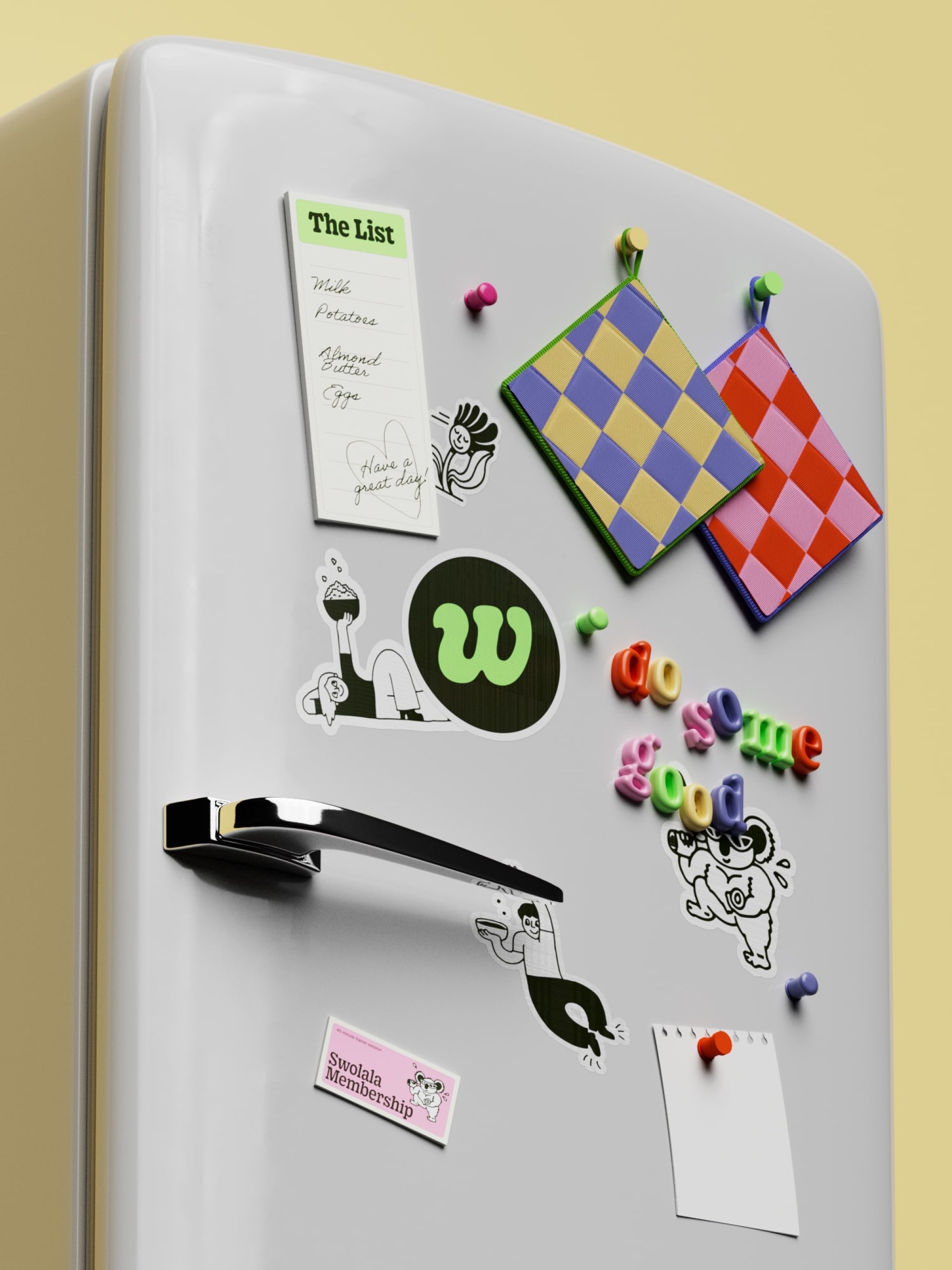
A helpful injection of joyful illustration
A suite of fun, hand-drawn illustrations not only bolstered the warmth and curiosity of the brand but also served a practical purpose, helping to both break up the design and provide a cute visual cue to communicate the brand’s key values.
Carefully considered meets delightfully offbeat
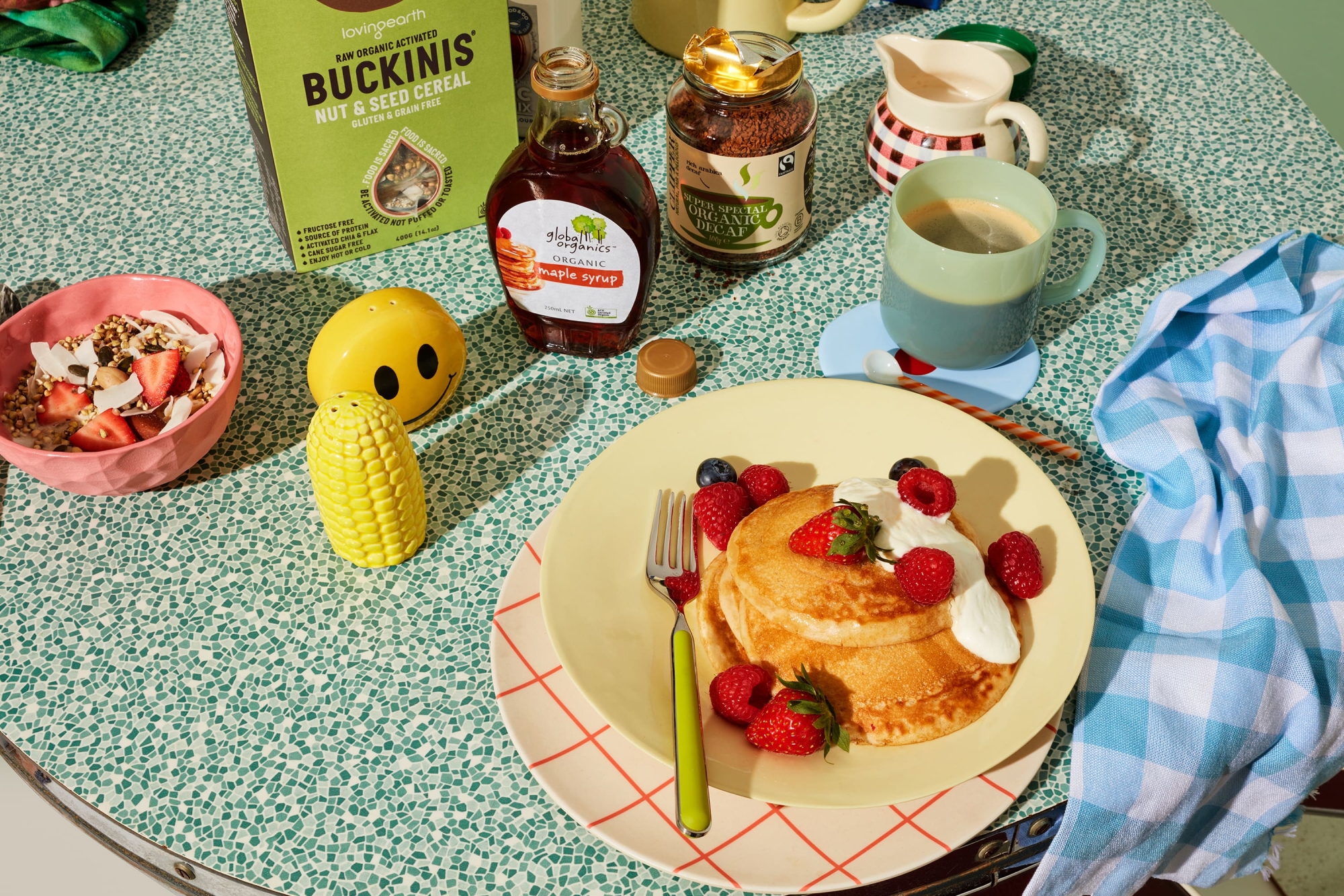
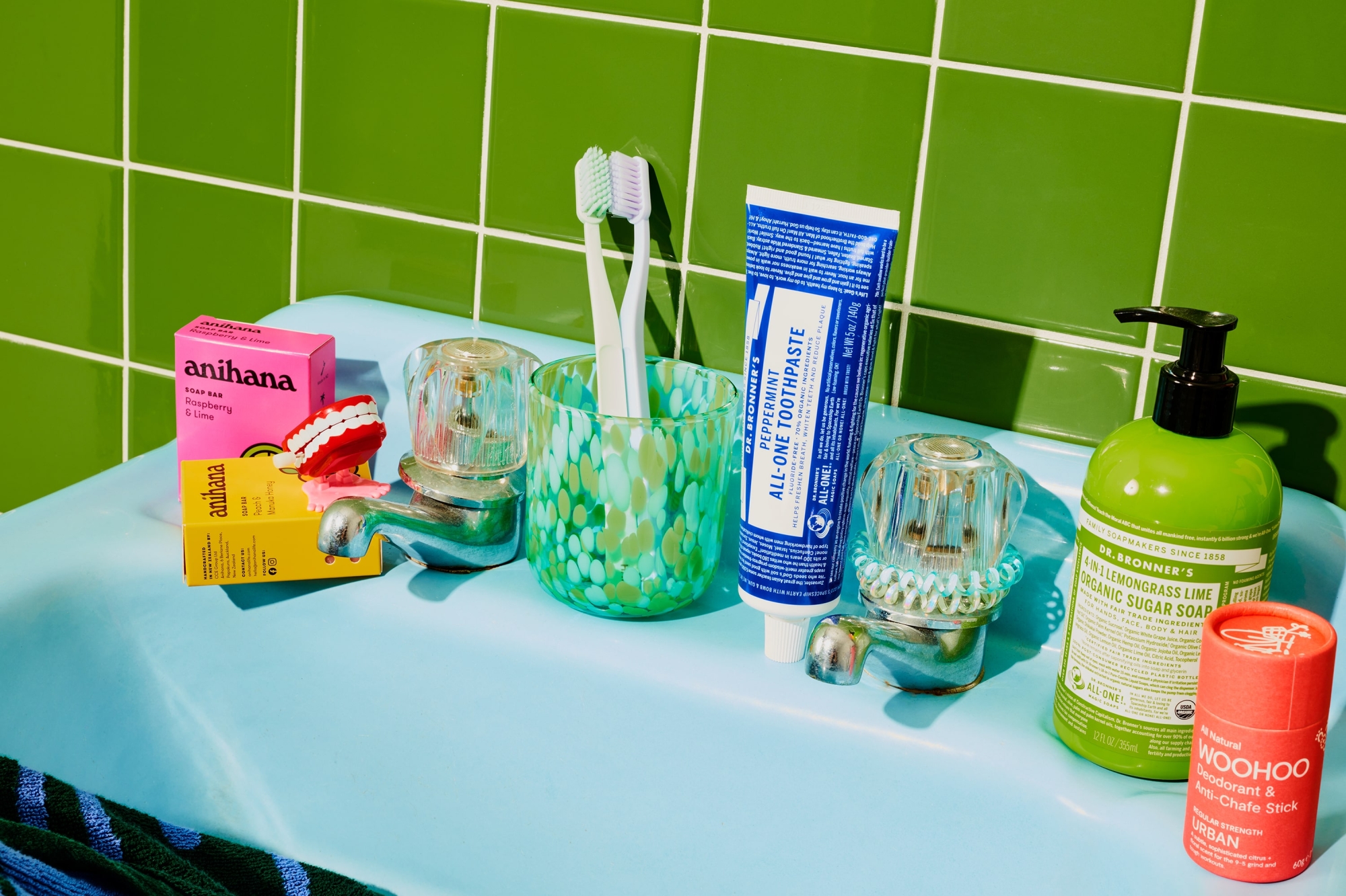
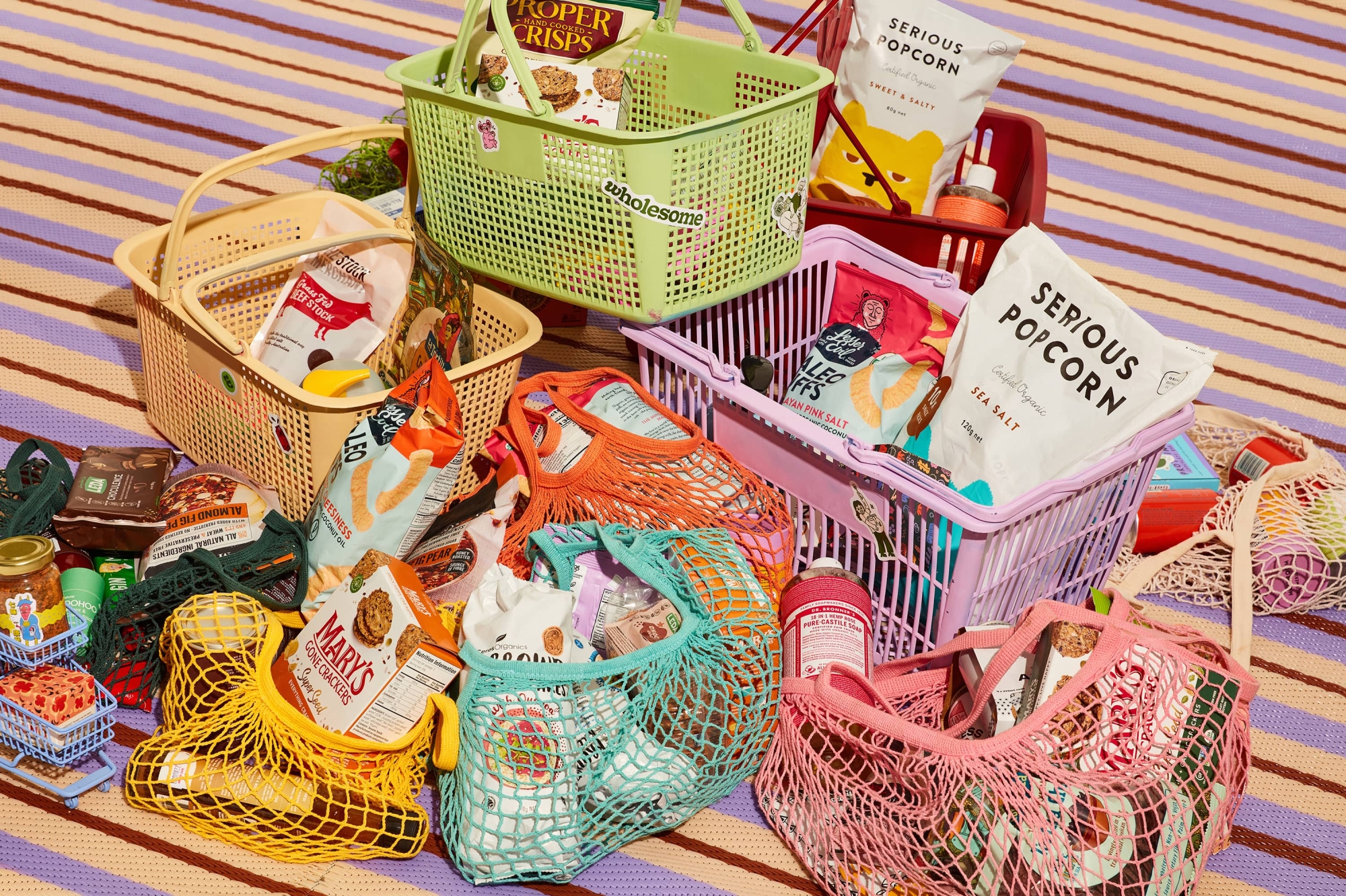
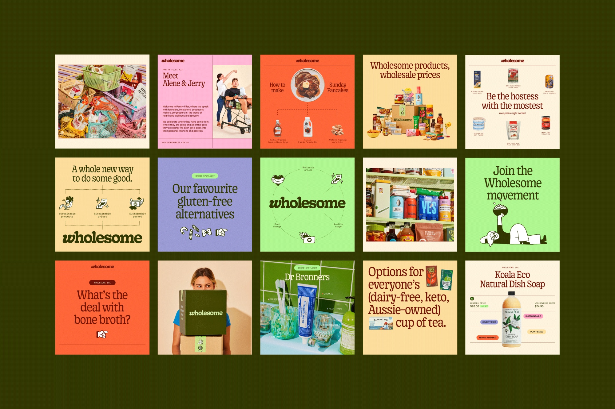
Alongside photographer Shelley Horan and stylist Jerrie-Joy Redman-Lloyd, a brand-led product shoot captured the energetic yet considered spirit of the brand. In a category thats art direction often skews either too minimal or overly messy, we wanted to avoid tropes. In a suite of images that reflect both the range they carry and the carefully curated nature of each product, there’s also clear evidence of fun. The unique, offbeat styling purposely blurs the lines between real and fake and utilises stop motion to capture moments of sheer delight.
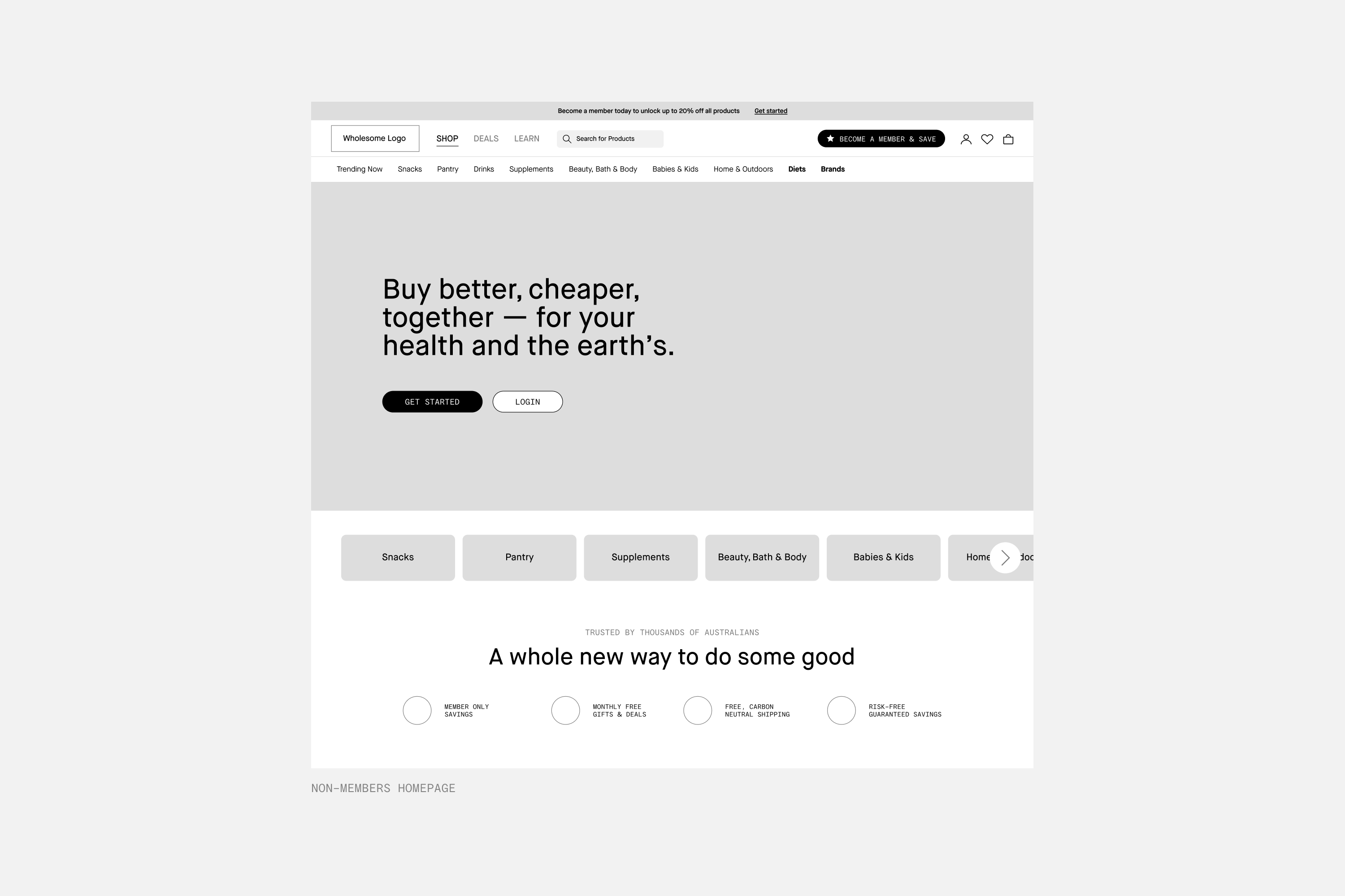
Two audiences, one all-encompassing website
As the key touchpoint for the brand, the entire digital output had to be savvy, simple and distil the value of what it means to be a Wholesome member… or not. For the first time since the brand’s inception, Wholesome was introducing the ability for non-members to shop with them, so two different experiences needed to be designed. Harking back to the brand strategy, we knew both needed to be intuitive and personal.
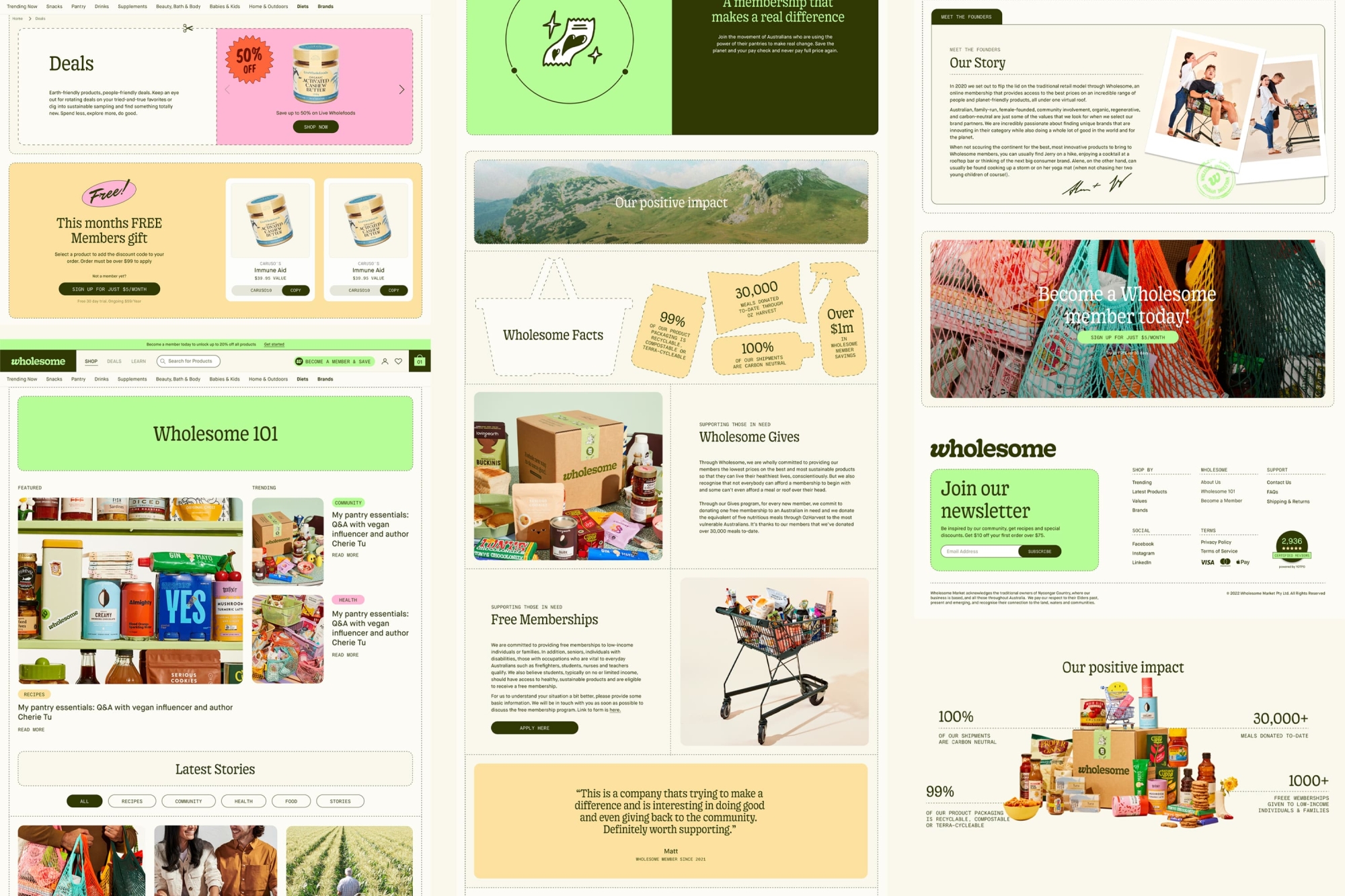
We wanted the site structure to be clean and modular — making it easy to move, swap and shuffle sections around while still being simple in navigation. Sections are both connected and separated using borders and lines — incorporating the pantry shelf and catalogue ideas that sit at the heart of the visual system. Never allowing the brand to become too stagnant or ordinary, we injected moments of delight into the user experience through immersive gems like a crossword puzzle the customer can complete.
A truly personalised customer experience
The shop page features the ability to apply more then 50 filters. Whether it’s lifestyle, diet, values, brand or impact, customers can truly personalise their shopping experience to match the good they want to do and, of course, save their preferences for later. The product page serves as an educational tool — providing customers with insights into who Wholesome are and what they believe in and a holistic overview of why its beneficial to shop with them.
An important part of the rebrand was enhancing the member experience. We introduced an account portal and membership rewards program, so existing members can now see how much they’ve saved over their lifetime with the brand, how many points they’ve accumulated and what they can redeem, as well as a quick re-order button.
And the end result?
In a bland and expensive category of greenwashing and empty brand promises, Wholesome show the world what it means to walk the walk. An important player in both the cost of living crisis and the fight against climate change, the Wholesome movement is powering on with integrity and we’re proud to have had a hand in giving it the identity it deserves.
Collaborators
- Brand Strategy • Untangld
- Photography • Shelley Horan
- Prop Stylist • Jerrie-Joy Redman-Lloyd
- Brand Writer • Cat Wall
LBDO
An intimacy brand that’s actually in touch.